In this previous post, I analysed the front cover of a fairly recent MOJO magazine. In this post I will be analysing the front cover of a recent edition of NME magazine. NME, which stands for New Musical Express, is a respected music magazine which is published by IPC Media. It focuses mainly on indie/alternative music with a some pop. The front cover is the April 2009 edition which is a special issue celebrating the 20th anniversary of The Stone Roses first album release.
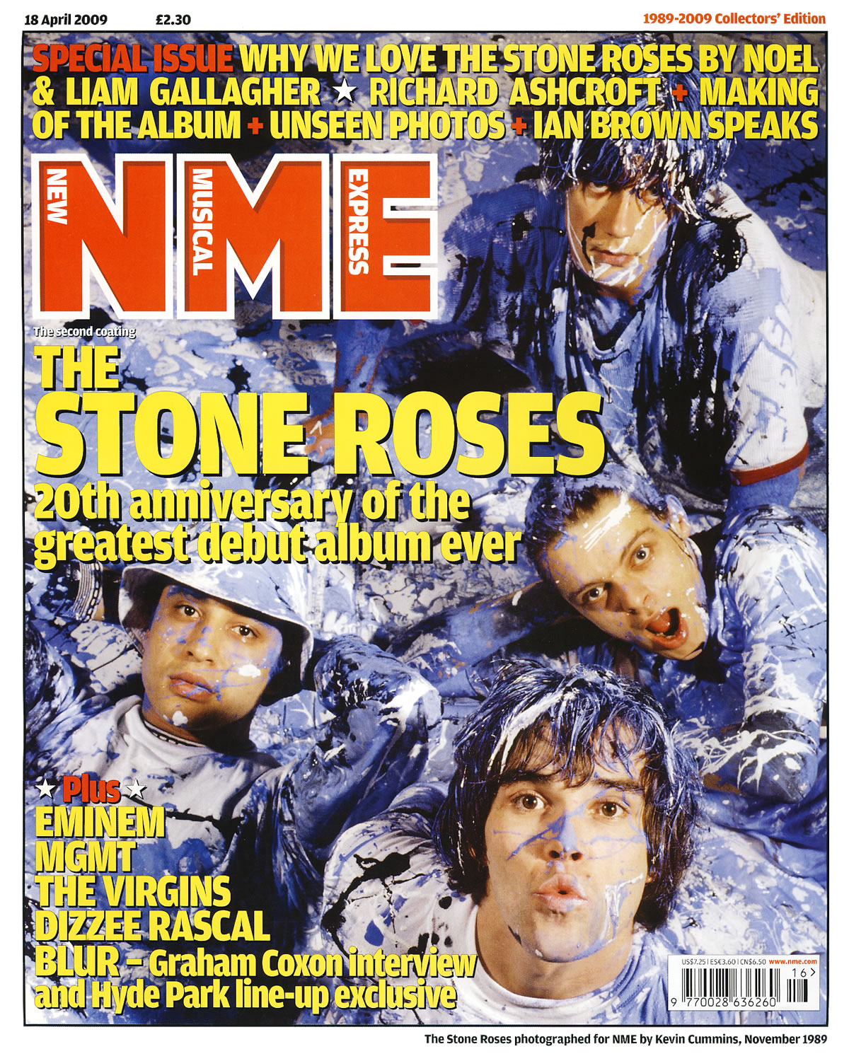
Because this is a special edition magazine, they have gone for a more old school/vintage look which makes the magazine look like it was designed in the 1990's. This look is achieved with the simple fonts and the use of just two colours for all the fonts on the page. The background image is a very old image that was taken in 1989 by NME themselves. The image shows the four band members of The Stone Roses covered in blue, black and white paint which contrasts the red and yellow fonts which are places over it. I didn't think that this colour scheme would work but in the instance, it does. A member of The Stone Roses, John Squire, was well known for his art and the background image is a huge throwback to this.
The magazine title is placed in the top left of the image and it is made up of just the letters 'NME' with the words New Musical Express placed inside their respective letters. The font used on the title is much simpler than most modern editions of NME magazine which is in keeping with the retro feel of the whole page. The main anchorage text is placed just below the main title. It simply quotes the bands name with '20th of the anniversary greatest album ever' written underneath. This sub anchorage uses two buzz words; greatest and ever. This makes the reader think in one of three ways. They agree with it, disagree with it or do not know who the band is. Either way, it might persuade them to buy the issue to read more about them.
Above the main title, there are three rows of sub anchorage which tell the user what else is in this edition. It also used the words 'Special Issue' in a red font rather than the yellow font used on the rest of the three rows. This different colouring makes the buzz word stand out. There is more sub text in the bottom left of the page where more artists who are in this edition are mentioned. The last one states 'BLUR - Graham Coxon intervew and Hyde Park line-up exclusive.' This is another case of a buzz word being used. In this case it is the word exclusive.
There is a white border around the whole page which makes the front cover look like it is in a picture frame. This again shows that this is an important, special edition which should be treated less like a magazine and more like a collector’s item. In the white border there is the date, price, issue name and a small caption for the image which states when and by who the photography was taken by. By putting these details in the border it keeps the page looking clean as the main image is only covered up by the main titles and anchorage.

 Posts
Posts


0 comments:
Post a Comment