Thursday, 19 November 2009

Contents Page Analysis: NME

The following contents page was taken from a 2008 edition of NME magazine.  See here, for a small description of who NME are.


The page starts with a fairly small NME logo in red and white in the top left with the page title 'This Week' and the date to the right of it in black.  Below the rest of the page is split into two columns.  The left column is actually a small article which shows reader two pictures that were sent by other readers.

Below the images there is a small amount of text about the article and a small advert below that.  This is strange for a contents page and breaks the general conventions of contents pages as most of the ones I have seen so far have contained just information about what is inside the issue, not articles of their own.

The right hand columns contains the usually contents page information.  It starts with main articles of the issue split into different sub-sections such as 'News' and 'Features', inside these sub-sections there and the pages numbers of the articles and a small title and description.  The title is in a bolder text and in bold where as the small description is is normal capitalisation and a smaller font.  Below this there is a small 'Plus' section with and a larger rectangle box with information about a 'Gig guide'.

Wednesday, 18 November 2009

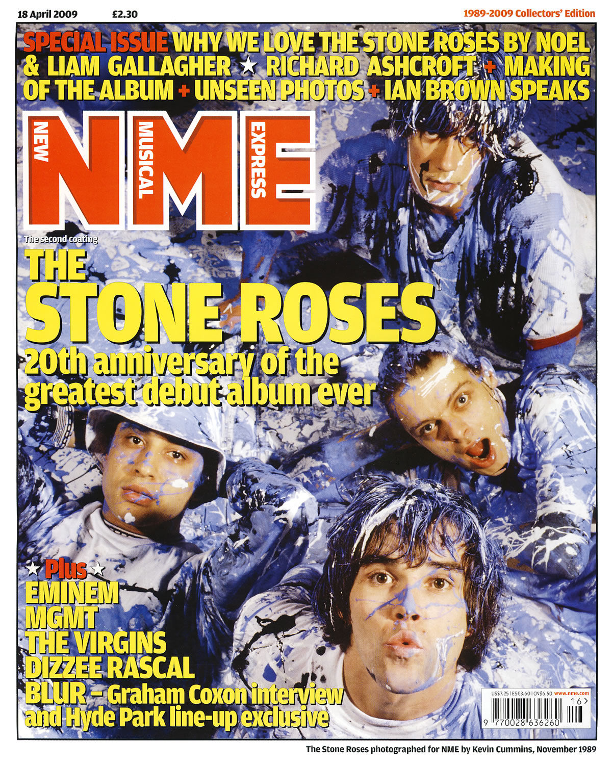
Front Cover Analysis: NME April 2009

In this previous post, I analysed the front cover of a fairly recent MOJO magazine.  In this post I will be analysing the front cover of a recent edition of NME magazine.  NME, which stands for New Musical Express, is a respected music magazine which is published by IPC Media.  It focuses mainly on indie/alternative music with a some pop.  The front cover is the April 2009 edition which is a special issue celebrating the 20th anniversary of The Stone Roses first album release.


Because this is a special edition magazine, they have gone for a more old school/vintage look which makes the magazine look like it was designed in the 1990's. This look is achieved with the simple fonts and the use of just two colours for all the fonts on the page. The background image is a very old image that was taken in 1989 by NME themselves. The image shows the four band members of The Stone Roses covered in blue, black and white paint which contrasts the red and yellow fonts which are places over it. I didn't think that this colour scheme would work but in the instance, it does. A member of The Stone Roses, John Squire, was well known for his art and the background image is a huge throwback to this.


The magazine title is placed in the top left of the image and it is made up of just the letters 'NME' with the words New Musical Express placed inside their respective letters. The font used on the title is much simpler than most modern editions of NME magazine which is in keeping with the retro feel of the whole page. The main anchorage text is placed just below the main title. It simply quotes the bands name with '20th of the anniversary greatest album ever' written underneath. This sub anchorage uses two buzz words; greatest and ever. This makes the reader think in one of three ways. They agree with it, disagree with it or do not know who the band is. Either way, it might persuade them to buy the issue to read more about them.

Above the main title, there are three rows of sub anchorage which tell the user what else is in this edition. It also used the words 'Special Issue' in a red font rather than the yellow font used on the rest of the three rows. This different colouring makes the buzz word stand out.  There is more sub text in the bottom left of the page where more artists who are in this edition are mentioned.  The last one states 'BLUR - Graham Coxon intervew and Hyde Park line-up exclusive.'  This is another case of a buzz word being used.  In this case it is the word exclusive.

There is a white border around the whole page which makes the front cover look like it is in a picture frame. This again shows that this is an important, special edition which should be treated less like a magazine and more like a collector’s item. In the white border there is the date, price, issue name and a small caption for the image which states when and by who the photography was taken by. By putting these details in the border it keeps the page looking clean as the main image is only covered up by the main titles and anchorage.

Tuesday, 10 November 2009

Front Cover Analysis: MOJO July 2009

In this post, I be will analysing the front covers of two magazines. This first front cover is the July 2009 edition of MOJO magazine.  MOJO magazine focuses on a large range of different music and the cover's main focus is on the band Kings Of Leon with sub-headings including James Taylor, Neil Young, Trent Reznor and Sex Pistols.  The main target audience for the magazine is 18-40 year olds who have a high interest in different styles of popular music.


The main magazine title is simply the word 'MOJO' in bold, white capital letters.  This is the same title as is used on every edition of MOJO magazine and by doing this they are promoting brand loyalty as previous customers should be able to easily recognise the magazine and even though the main ikmage partially covers the title, it is should still be clear to most people of what it is saying.  Their slogon, 'The Music Magazine', has also been placed over the title in a font that is very similar to handwriting, this gives the impression that it has been physically written over the top.  The slogan itself gives the impression that this magazine is the best in its class.

The front cover features the band Kings Of Leon with main anchorage text saying 'Kings Of Leon' and sub anchorage text saying 'on the road with the world's biggest band.'  This instantly connotes that Kings Of Leon are a huge band and that the reader should be surprised if they haven't already heard of them.  There is a smaller banner to the top right of the main anchorage with the word 'Exclusive!' on it.  This is a buzz word that grabs the users attention and shows to them that this article is exclusive to this magazine.  The word 'biggest' in the sub anchorage is also a buzzword that makes the reader think.  Do they agree with the bold statement?

The main image is a medium close up of each of the members of Kings Of Leon side by side.  The whole picture is in black and white and when put with the looks on their faces gives an overall serious tone.  This could be used to connote how their music has developed into me serious material compared to their jokey, upbeat stuff on their first two records.

The colour scheme on the page is mainly green, black and white (apart from the exclusive banner on the anchorage text, which completely contrasts the rest of the page.)  The colour scheme is matched with the free CD that came with this edition and the alternate cover for Kings Of Leon's fourth and current studio album, Only By The Night. (see here)  The font style is also very similar, if not the same, as on the alternate cover. (See the top right and left of the cover).  The overall layout of the cover is very symmetrical and the matching fonts and colour make the page look very stylised and professional.  This is almost the opposite of some covers from magazines like NME (see here) where the cover is very cluttered and unprofessional.  This styling give the impression that the readership inside the magazine should be very good and that it should be one of the best magazine in the genre.

In the top left of the page, there is a small puff which is simply advertising the free CD that came with this edition.  It is in the same green and white that is used on the rest of the page, so it does not jump out of the page at the reader, but it lets them know that their is something extra with the edition.  To this right of this put there is two sub images with white outlines that almost looks like they have been scattered on the top of the page.  This could make the page look messy but the sub text for these images are aligned horizontally to keep the clean, professional feeling and the same colours and fonts as on the rest of the page are also used.


Thursday, 5 November 2009

Double Page Spread Analysis: MOJO Magazine (The Doves)

In order to gain a better understanding of magazine articles, and in particular double page spreads, I will be analysing a couple of articles to find out why they have made the decisions they did when it come to the layout of the article.  This could include the colour, placement etc of the elements that make up the article.


The first article that I will be looking at is an double page spread article from the music magazine MOJO and it is about the band 'The Doves'.  I will continue to break the article down and discuss the different elements on the page below.

Main Image

The main image is positioned in the the top left of the page and it takes up a quarter of the page.  The photography is taken at a low angle that which gives the bass player seem like the one in control.  The guitar player is also off centre, on the two left hand focal point as of the rule of thirds and this gives the feeling that the viewer is in the crowd watching the band live.  Also, the caption of the image is placed in an unusual position in between two columns at the bottom of the page.

Sub-Images

The 3 sub images are located in the top right hand of the page.  They are all close up's of the band members faces and have been post-processed into black and white.  This makes them look like mugshots/E-fit pictures which relates fairly dark park of the article below in which they talk about music being their life and saying that without music, they are nothing.  The white border also makes the pictures look like polaroids and their slightly off-centre rotation makes them look like the have been scattered on the page which emphasizes the informal look of the page and seems to be in line with the bands attitutde of how they are normal (or informal) guys even though they are in a band.

Puff

There is one puff in the article and it is placed in the top right of the two pages just below the sub images.  The puff is a bright red colour with yellow writing which stands out from the rest of the article, especially against the black and white of the sub images above.
It quotes "If I don't create music, I'm nothing" which as a quote on it's own sound it dark and serious, although within the article, the quote seems nowhere near as serious.  "If you've still got songs within you, you need to get them out.  I'm happiest when I'm writing music. If I don't create music, I'm nothing!"  The quote has been purposely thrown out of contents for dramatic effect.

Article Layout

The main article starts off with the main title that says 'Two Nights In Bird Land', this is a pun of the bands name, The Doves.  The background colour of the title is a bright yellow colour which stands out against the blacks and whites of the rest of the page.  The yellow matches with the yellows of the main images in cluding the stage lights and the drum kits which give the page a consistent colour scheme and makes it look professional.  The title is also slightly textured, which makes it look weathered and old, like the members of the band especially as shown in the sub-images.

Article Contents

All thought out the article, there are several hints to how the band are just normal, down to earth guys with their humour shown in the parts of the article where there interview is used.  For examples when Jez says "But he his shirts from Anges B".  During the interview sections of the article, their accents and colloquialism shows through and this adds to the articles informal tone.  The way the interview if presented, it makes you feel close to the band like you are there at the interview and listening to their responses first hand.  This relates to the main image where the angle of the shot makes the viewer feel like they are standing in the crowd at one of their gigs.  Their are also several journalistic comments on the interview, like "That it has" after they were talking about their appearance, which  makes it feel like you are talking to the interview as well.  Although there is a lot of humour shown throughout the article, a more serious side is shown towards to the end where the band are talking about their music and how if they did not make music they would be nothing.

The article is not all interview though.  It starts off as a review of the concert the band played in Manchester then moves into the interview with the band.  It then gives some detailed information about the bands background their discography before talking about their current going on and ends with a look to the future.