I feel that I have a different view on graphic design than I did before. I have learnt that It is much more difficult than it looks to get the ideas down in your head on to the computer screen, especially without good knowledge of the program for doing it. I started off by using a more basic program called Microsoft Publisher for my preliminary task which gave me a good idea of how desktop publishing programs work. I then moved on to the more advanced program called Adobe Photoshop Elements which gave greater control over the design elements of the magazine. I feel that I have progressed well and now have a good understanding of graphic design and would be comfortable to take on another similar project.
Friday, 18 December 2009
Looking back at your preliminary task, what do you feel you have learnt in the progression from it to the full product?
How did you attract/address your audience?
In order to know what my audience would want in a music magazine I had to find out about my audience. I did this in two ways. The first method was primary market research with the use of an online questionnaire whcih could be filled in quickly and easily. I sent links around to my friends using social networking sites in order to get people to answer the questionnaire. I then created several graphs once all the data has been collected which made the information easier to process. The results from this information can been seen here.
Another way in which I found out about my audience was by using forums from magazine similar to the one I created. One that I read through extensively was the Mojo magazine forums. From here I was able to see what music the readers of Mojo magazine generally listen to.
What have you learnt about technologies from the process of constructing this product?
During the process of constructing my magazine I have learnt a lot about different technologies, hardware and software based. When I first started to plan my magazine, I started by designing a collage magazine which was designed in Microsoft Publisher. I found that, although appropriate for the task in hand, it was hard to make the designed look professional enough to pass as a genuine magazine. The problem was that there was not much fine control over the elements of the page such as the text boxes and shapes, which meant that resizing and colouring were as far as I could go. I did however incorporate some transparency which helped to make the design look a little more professional.
For my main magazine, I moved on to two programs made by Adobe. The first was Adobe Photoshop Elements and the other was Adobe InDesign CS4. Adobe Photoshop Elements is a raster image editing product which is basically a simpler version of Adobe Photoshop, which is aimed at less professional users such as photographers. The program makes it much easy than Microsoft Publisher to create the design you want with much finer control over the different elements that make up the page. The program also has extensive photography editing tools which make it easy to manipulate images. I used these features to make some my original images black and white and to add a cross-processed effect to the main image on my double page spread.
For the actual double page spread, I used Adobe InDesign CS4 which is a professional desktop publishing application which is generally used to create poster, flyers and magazines. It basically a more advanced version of Microsoft Publisher (which is also a DTP application) with more focus on advanced layout techniques and effects. Over the course of creating my magazine I have learnt a lot about the programs that I've used. I have learnt basic photo editing techniques, layout design, the use of effects (such as drop shadow) on elements, the use of opacity settings. In using all these techniques I feel that I have built a professional and good looking front cover, contents page and double page article. I also learnt different photography techniques, which I needed for taking the pictures for my magazine. Some of these techiniqes include framing with the rule of thirds, headroom and lead room.
The blogging element of this coursework was new to me when we first started as I had never attempted blogging before but after a while spent messing around with the different features I found it to be very similar to word processing, just found within the browser. Through the course of creating my blog I learnt about such features as font formatting, hyperlinks, inserting images and basic blog management (editing and publishing posts).
Who would be the audience for your media product?
I believe that the audience for my media product would be mainly young males from the age range of 16-25. I think this because for my market research I conducted an online questionnaire (the results of which can be viewed here) and around 80% of them were males.

What kind of institution might distribute your media product and why?
In order for a music magazine to be sucessful, they have to have good backing from a publishing house. If I had the choice of any I would choose Development Hell Ltd. Development Hell independent media company based in Islington, London. They were formed from ex-Emap (here) executives David Hepworth, Terry Perkins, Mark Ellen and Andrew Harrision. Their business plan involves launching 3 magazines in 6 years.


Mixmag is a British dance music and clubbing magazine. It tagline is "the worlds biggest selling dance music magazine." Mixmag was first issued in February 1983 and was published by DMC. The magazine was then bought by EMAP in the mid-1990s before being bought by Development Hell in 2005. Development Hell re-launched the magazine in was marketed much differently by Development Hell and the revamp in design helped to focus he magazine on a younger audience (both male and female) rather than the previously older audience it used to aim. Also, in April 2009 they bought DontStayIn.com, the world's biggest clubbing social network.

I believe that Development Hell Ltd would be a good choice to publish my music magazine because, firstly, they stated in their business plan that they want to launch 3 magazines within 6 years and as of now they have only released 2. This means that they will probably be looking for a 3rd magazine and as neither of them if focuses on rock music, my magazine might fit into their line-up very well.
In what ways does your media product use, develop or challenge forms and conventions of real media products?
Overall, my music magazine conforms to most music magazine conventions. The front cover has a large, stylised masthead at the top of the page which is made up of the word ‘Amped’ in a very grungy font. By adding shadow and some grunge brush strokes over the top, the masthead became more of a logo rather that just text. The issue number, website and date are places just to the right of the masthead, like on most music magazines.
My overall design was heavily influences from my research into current music magazines like Mojo and NME. I found through market research that people preferred a classy, professional design like Mojo and most people did not like the sometimes messy layout of magazines like NME. An example of a Mojo front cover that heavily influenced my choices is shown below, along side my magazine.

As you can see, the designs are very similar, with a black and white image for the background which is relevent to the main anchor and bright colours for the title and other anchors to make the page more interesting. The anchors are made up of a title with a large font and a smaller tagline underneath, which gives the reader a small idea of what will be inside the issue. The barcode at the bottom of the page and the circular puff indicating the price of the magazine are two conventions of music magazines that I have decided to stick to with my magazine. The use of an out of place colour for the background of the word exclusive is something that is often used on magazine covers, like on the Mojo magazine on the left. The word exclusive is also a buzz word. Buzz words are used often on magazines as they help to attract the users attention.
My double page spread is designed in a similar way to double page spreads in current magazines, like the front page. It consists of a large ‘main’ image and two smaller images with an article title and the article text. The main image has to been post-processed to give it a cross-processed look which makes the image look more stylised and interesting than a normal colour image would. More examples of cross processed images can be seen here and here. A screenshot of my double page spread is shown below.

The two smaller images have a thick, black border and have been rotated which makes them look like they are pictures that have been scattered on the page. The article text is put into several thin columns, which is generally the norm in music magazines. My design of this page is influenced from one of the double page spreads that I analysed, see here.

My contents page is styled similarly to my front cover with the same colour scheme used. It is made up of a main title and date at the top of the page in a large font (the same fonts used on the front page.) Below that there is a grey banner across the page with two images inside relating to the same article. In the top right of the right hand image there is a page number and on the right hand image there is the word 'Exclusive' in a red font, as on the front cover.
Below the banner and image the page is split into two columns. The left hand colums is made up of a title whcih is made up for a small rectangle and below that there is the page list, also in a rectange, but in a different colour. The left hand column contain the 'features' of the magazine, which means that the article are new for this edition, and the right hand columns contains the 'regulars' which appear in the magazine every week.
How does your media products represent particular social groups?
As my magazine is mainly focused towards young males, it was important to represent them through the images and writing in my magazine. The images in my magazine were of my friends band. They are dressed stereotypically like members of a rock band would, with skinny jeans and checked shirts. And although this is a very broad stereotype I still feel that just by looking at the dress of the people in my pictures, it is obvious to see what type of music they play. I found out more about the people in my target market by reading the forums of music magazine MOJO, which my magazine was heavily influenced from. The forums can be seen here. By reading this forums I got to see what type of music and what interests my target market at into, which made it easier for me to write my articles.
Tuesday, 15 December 2009
Final Designs
After all this effort I have finally completed my final designs. My final designs consist of a front page, contents page and a double page spread. Images of them are shown below and larger images are available on clicking.
Front Cover

Contents Page

Wednesday, 9 December 2009
Contents Page Analysis: Drummer Magazine
The first contents page that I will be analysing is on from 'Drummer' magazine, which is a general music magazine which a more heavy focus on drums and percussion, including reviews and thoughts of the latest equipment. The contents page is shown below.

The top left of the page contains the title and date of the page. The word 'Contents' is written in a large white font which contrasts the red background well and the date is placed directly above it it a much large font but a much darker colour which makes it pair more with the red background rather than the title text.
The magazine logo, which is simply the word 'DRUMMER' in bold capitals, is placed just below the page title and the rest of the top third of the page is filled with three images. The image to the right of the Drummer logo is a drum set, which relates directly the the main focus of the magazine and helps set the genre well. The two other images are at the top of the page and are of two artists of which large articles are further into the magazine; there are page numbers in the top right of each image indicating where they can be found in the magazine. Red boxes are used around the white font of the page numbers are used, as with the page title, to make them stand out.
Below this, on the right hand side, there is three other images. A large (or main) image which shows Dave Lombardo during a live show. The buzzword 'Exclusive' is shown to the right hand side of the image and overlaps into the left hand column of text and acts as an arrow to the relevant item in the contents list. Using buzzwords like exclusive help grab the readers attention by telling them that this article can only be read in this magazine, this may persuade them to purchase the magazine. Below the main image there are two smaller images, one of which shows another drummer during a live set and four members of a band. All of these images are similar to the images at the top and also have page numbers in the top corner.
The left hand column of the page is the main contents list. The list is split into two sections: Features and Regulars. Features are articles that will differ each week, these mainly include band interviews. The regulars on the other hand are articles that are shown in each issue of the magazine, the only thing that changes is their content. The feature title are all in a fairly big black font with a large red page number to the right with a small description of what the article is about. The regulars on the other hand are just small titles with no descriptions, this is because the editors probably expect most fairly regular buyers of the magazine to recognise the articles and to know what they are about.
Thursday, 19 November 2009
Contents Page Analysis: NME
The following contents page was taken from a 2008 edition of NME magazine. See here, for a small description of who NME are.

The page starts with a fairly small NME logo in red and white in the top left with the page title 'This Week' and the date to the right of it in black. Below the rest of the page is split into two columns. The left column is actually a small article which shows reader two pictures that were sent by other readers.
Below the images there is a small amount of text about the article and a small advert below that. This is strange for a contents page and breaks the general conventions of contents pages as most of the ones I have seen so far have contained just information about what is inside the issue, not articles of their own.
The right hand columns contains the usually contents page information. It starts with main articles of the issue split into different sub-sections such as 'News' and 'Features', inside these sub-sections there and the pages numbers of the articles and a small title and description. The title is in a bolder text and in bold where as the small description is is normal capitalisation and a smaller font. Below this there is a small 'Plus' section with and a larger rectangle box with information about a 'Gig guide'.
Wednesday, 18 November 2009
Front Cover Analysis: NME April 2009
In this previous post, I analysed the front cover of a fairly recent MOJO magazine. In this post I will be analysing the front cover of a recent edition of NME magazine. NME, which stands for New Musical Express, is a respected music magazine which is published by IPC Media. It focuses mainly on indie/alternative music with a some pop. The front cover is the April 2009 edition which is a special issue celebrating the 20th anniversary of The Stone Roses first album release.
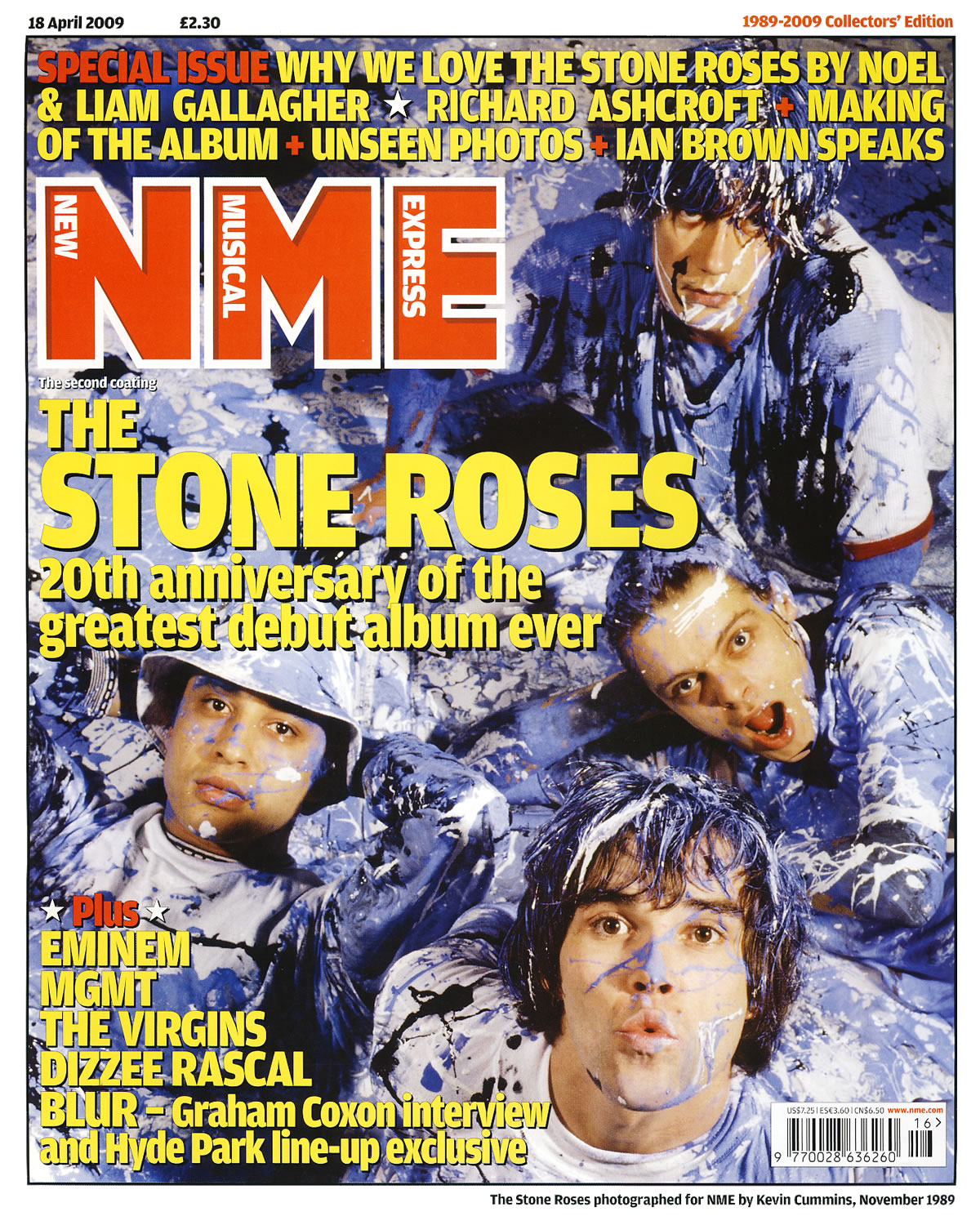
Because this is a special edition magazine, they have gone for a more old school/vintage look which makes the magazine look like it was designed in the 1990's. This look is achieved with the simple fonts and the use of just two colours for all the fonts on the page. The background image is a very old image that was taken in 1989 by NME themselves. The image shows the four band members of The Stone Roses covered in blue, black and white paint which contrasts the red and yellow fonts which are places over it. I didn't think that this colour scheme would work but in the instance, it does. A member of The Stone Roses, John Squire, was well known for his art and the background image is a huge throwback to this.
The magazine title is placed in the top left of the image and it is made up of just the letters 'NME' with the words New Musical Express placed inside their respective letters. The font used on the title is much simpler than most modern editions of NME magazine which is in keeping with the retro feel of the whole page. The main anchorage text is placed just below the main title. It simply quotes the bands name with '20th of the anniversary greatest album ever' written underneath. This sub anchorage uses two buzz words; greatest and ever. This makes the reader think in one of three ways. They agree with it, disagree with it or do not know who the band is. Either way, it might persuade them to buy the issue to read more about them.
Above the main title, there are three rows of sub anchorage which tell the user what else is in this edition. It also used the words 'Special Issue' in a red font rather than the yellow font used on the rest of the three rows. This different colouring makes the buzz word stand out. There is more sub text in the bottom left of the page where more artists who are in this edition are mentioned. The last one states 'BLUR - Graham Coxon intervew and Hyde Park line-up exclusive.' This is another case of a buzz word being used. In this case it is the word exclusive.
There is a white border around the whole page which makes the front cover look like it is in a picture frame. This again shows that this is an important, special edition which should be treated less like a magazine and more like a collector’s item. In the white border there is the date, price, issue name and a small caption for the image which states when and by who the photography was taken by. By putting these details in the border it keeps the page looking clean as the main image is only covered up by the main titles and anchorage.
Tuesday, 10 November 2009
Front Cover Analysis: MOJO July 2009
In this post, I be will analysing the front covers of two magazines. This first front cover is the July 2009 edition of MOJO magazine. MOJO magazine focuses on a large range of different music and the cover's main focus is on the band Kings Of Leon with sub-headings including James Taylor, Neil Young, Trent Reznor and Sex Pistols. The main target audience for the magazine is 18-40 year olds who have a high interest in different styles of popular music.

The main magazine title is simply the word 'MOJO' in bold, white capital letters. This is the same title as is used on every edition of MOJO magazine and by doing this they are promoting brand loyalty as previous customers should be able to easily recognise the magazine and even though the main ikmage partially covers the title, it is should still be clear to most people of what it is saying. Their slogon, 'The Music Magazine', has also been placed over the title in a font that is very similar to handwriting, this gives the impression that it has been physically written over the top. The slogan itself gives the impression that this magazine is the best in its class.
The front cover features the band Kings Of Leon with main anchorage text saying 'Kings Of Leon' and sub anchorage text saying 'on the road with the world's biggest band.' This instantly connotes that Kings Of Leon are a huge band and that the reader should be surprised if they haven't already heard of them. There is a smaller banner to the top right of the main anchorage with the word 'Exclusive!' on it. This is a buzz word that grabs the users attention and shows to them that this article is exclusive to this magazine. The word 'biggest' in the sub anchorage is also a buzzword that makes the reader think. Do they agree with the bold statement?
The main image is a medium close up of each of the members of Kings Of Leon side by side. The whole picture is in black and white and when put with the looks on their faces gives an overall serious tone. This could be used to connote how their music has developed into me serious material compared to their jokey, upbeat stuff on their first two records.
The colour scheme on the page is mainly green, black and white (apart from the exclusive banner on the anchorage text, which completely contrasts the rest of the page.) The colour scheme is matched with the free CD that came with this edition and the alternate cover for Kings Of Leon's fourth and current studio album, Only By The Night. (see here) The font style is also very similar, if not the same, as on the alternate cover. (See the top right and left of the cover). The overall layout of the cover is very symmetrical and the matching fonts and colour make the page look very stylised and professional. This is almost the opposite of some covers from magazines like NME (see here) where the cover is very cluttered and unprofessional. This styling give the impression that the readership inside the magazine should be very good and that it should be one of the best magazine in the genre.
In the top left of the page, there is a small puff which is simply advertising the free CD that came with this edition. It is in the same green and white that is used on the rest of the page, so it does not jump out of the page at the reader, but it lets them know that their is something extra with the edition. To this right of this put there is two sub images with white outlines that almost looks like they have been scattered on the top of the page. This could make the page look messy but the sub text for these images are aligned horizontally to keep the clean, professional feeling and the same colours and fonts as on the rest of the page are also used.
Thursday, 5 November 2009
Double Page Spread Analysis: MOJO Magazine (The Doves)
In order to gain a better understanding of magazine articles, and in particular double page spreads, I will be analysing a couple of articles to find out why they have made the decisions they did when it come to the layout of the article. This could include the colour, placement etc of the elements that make up the article.

The first article that I will be looking at is an double page spread article from the music magazine MOJO and it is about the band 'The Doves'. I will continue to break the article down and discuss the different elements on the page below.
Main Image
The main image is positioned in the the top left of the page and it takes up a quarter of the page. The photography is taken at a low angle that which gives the bass player seem like the one in control. The guitar player is also off centre, on the two left hand focal point as of the rule of thirds and this gives the feeling that the viewer is in the crowd watching the band live. Also, the caption of the image is placed in an unusual position in between two columns at the bottom of the page.
Sub-Images
The 3 sub images are located in the top right hand of the page. They are all close up's of the band members faces and have been post-processed into black and white. This makes them look like mugshots/E-fit pictures which relates fairly dark park of the article below in which they talk about music being their life and saying that without music, they are nothing. The white border also makes the pictures look like polaroids and their slightly off-centre rotation makes them look like the have been scattered on the page which emphasizes the informal look of the page and seems to be in line with the bands attitutde of how they are normal (or informal) guys even though they are in a band.
Puff
There is one puff in the article and it is placed in the top right of the two pages just below the sub images. The puff is a bright red colour with yellow writing which stands out from the rest of the article, especially against the black and white of the sub images above.
It quotes "If I don't create music, I'm nothing" which as a quote on it's own sound it dark and serious, although within the article, the quote seems nowhere near as serious. "If you've still got songs within you, you need to get them out. I'm happiest when I'm writing music. If I don't create music, I'm nothing!" The quote has been purposely thrown out of contents for dramatic effect.
Article Layout
The main article starts off with the main title that says 'Two Nights In Bird Land', this is a pun of the bands name, The Doves. The background colour of the title is a bright yellow colour which stands out against the blacks and whites of the rest of the page. The yellow matches with the yellows of the main images in cluding the stage lights and the drum kits which give the page a consistent colour scheme and makes it look professional. The title is also slightly textured, which makes it look weathered and old, like the members of the band especially as shown in the sub-images.
Article Contents
All thought out the article, there are several hints to how the band are just normal, down to earth guys with their humour shown in the parts of the article where there interview is used. For examples when Jez says "But he his shirts from Anges B". During the interview sections of the article, their accents and colloquialism shows through and this adds to the articles informal tone. The way the interview if presented, it makes you feel close to the band like you are there at the interview and listening to their responses first hand. This relates to the main image where the angle of the shot makes the viewer feel like they are standing in the crowd at one of their gigs. Their are also several journalistic comments on the interview, like "That it has" after they were talking about their appearance, which makes it feel like you are talking to the interview as well. Although there is a lot of humour shown throughout the article, a more serious side is shown towards to the end where the band are talking about their music and how if they did not make music they would be nothing.
The article is not all interview though. It starts off as a review of the concert the band played in Manchester then moves into the interview with the band. It then gives some detailed information about the bands background their discography before talking about their current going on and ends with a look to the future.
Friday, 9 October 2009
Preliminary Task
For my preliminary task, I had to create the front page and the contents page for a school magazine. I have completed this task and the two pages are shown below.
Front Cover

Contents Page

Thursday, 8 October 2009
Questionnaire Results
About a week ago, I created an online questionnaire about music magazine use. The questionnaire asked gerneal questions about the reader and about if they bought music magazines, why they did and why they didn't and their general preferences. As of now 23 people have completed my questionnaire with a mix of people who do and do not read music magazines regularly. The results are shown below in graphical form.
The first question asked if the reader read music magazines. I was lucky and got a nice mix of people who did and did not read them.

The result from this question lead the reader in one of two ways. If the reader answered yes, they were asked to answered to answer a set of questions and if they answered no they were asked to answer a slightly different set of questions. I will discuss the differences answers from music magazine readers first.
Magazine Readers
The second and third questions were two simple questions about the reader to break them in to the questionnaire.


The fourth question asked the reader how they usually get their music. The results showed that most people got their music from online downloads, however some people do still use traditional CDs. 4 people also said that they used music streaming services which are becoming more popular with services like Spotify and Pandora.

The fifth question was another music orientated question. I asked the reader what generally makes them like a band. Not suprisingly, most people said that the style of music and the lyrics were the most important things, but suprisingly only one person though the appearance of the band was the most important thing.

The next two questions were general music questions and asked the reader their favourite genre and band/artist. The results are shown below and are the popular genres are rock/indie/alternative and the bands mentioned are also mainly rock orientated.


The last question in the section asked the reader if they attended music festivals and most of them did.

The next section was moved away from the readers musical tastes and asked them about they music magazine usage. Question 9 asked the reader what music magazine they actually read, the results are shown below.

The next question asked the reader what their main reason for buying a music magazine were. Most people said they they wanted to keep up with the latest music news and to read interview with bands. Some people also said that they liked to hear about new bands

The next question asked the reader how often they bought music magazines with half of them saying they they only bought them every so often but the other half saying that they bought them regularly, either weekly, bi-weekly or monthly.

The following question was not multiple choice question but asked the reader to write what they though they would change about the magazine. Their answers are shown below.

Tuesday, 29 September 2009
Music Magazine Questionnaire
In order for me to design my music magazine I need feedback from people who read (and don't read!) music magazines and their reasons for doing so. This questionnaire is my first piece of primary research and it will enable me to obtain up to date information about what my target market want or expect from a music magazine. With the information obtained from the questionnaire I feel that I will be able to design a successful music magazine myself.
The questionnaire that I designed with Google Docs is embedded in the blog below or can be viewed in full here.
Monday, 28 September 2009
Welcome!
Hello and welcome to my blog!
My name is Oliver and I am a student at Deyes High School studying Media Studies. Over the next 6 months or so I will be updating this blog with my progress on my coursework and the related research. The aim of this blog is to clearly show my progress in a diary-like style to show the different stages of work done during my coursework. I hope as the posts go on, my personal development will become clear.
What is my brief?
The brief that I have been given has been split up into two tasks; one smaller task and one larger one. The smaller task is the preliminary task which will involve designing and creating the front page of a school newsletter the audience of which is the students attending the school and their parents. The front cover must contain an original medium close up (MCU) image.
The other task is the main task which involves designing and creating the front cover, contents page and a double page spread for an original music magazine. I have to take several music related photographs to use on each page.
In order to design each of the tasks successfully I will need to carry out both primary and secondary research so that I am able to get a feel for the target market and so that i can design magazines with features and styles that people who will buy the magazine will want. The first part of my primary research is a questionnaire that I designed about music magazines. It can be viewed here and the results will follow shortly.
UPDATE: The results from my questionnaire can be viewed here.
What are your intentions?
I intend to start by doing primary and secondary research into the music magazine market. I will try to figure out what the people who buy music magazines want from music magazines, the reasons for why some people do not buy music magazines and what would possibly persuade them to do so. Once I have completed both my primary and secondary research, I will be able to analyse the data that I will have collected to see what the view of my target market are.
With the results of this analysis, I will be able to get a good picture of how I feel I need to design my magazine in order to please the people who will be buying it.
What are you intending to do first?
The first step that I plan to take is to start my primary research and create a questionnaire which can be complete easily online. The questionnaire will contain two different sets of questions; one set for people who do read music magazines and another set for people who do not. As I will be doing it online, the results from the questionnaire will be automatically to a spreadsheet which I can view as raw data or in graph form to make better sense of the information.
What are you going to do for your research?
As mentioned above, my primary research will involve creating a questionnaire with two different sets of questions; one set for people who read music magazines and one set for people who don't. I will the collate the data an analyse the results to make guidelines for creating my magazine. As for my secondary research, to complete that I will analyse the magazine covers and articles of current music magazines so see how they have used different techniques to represent different things and to show different ideologies.
Subscribe to:
Posts (Atom)

